Saturday, January 30, 2010

"Brush with Fame"

My local clay organization's newsletter has a short questionnaire for members. Each month, two or three responses are published. The first question is, "Have you ever had a brush with fame?"

I wondered, did they mean Your fame or an experience with someone famous?

That set my mind on a spin-trip.

The first thing I thought of was, when I was in grade school, I met and shook hands with both Harry Truman and Thomas Hart Benton. I don't recall whether the event was the opening of the Truman Library or if it was "Thomas Hart Benton Day", but I seem to remember it was the latter. It was a rather small gathering; a short ceremony. I can still hear that unmistakable Truman voice. Mr. Benton, however, was a very soft-spoken man and said little. What struck me was that both men were not very tall. As a matter of fact, I remember feeling shocked.


Shaking hands with them was a real contrast. Although Truman had a firm enough handshake, it was that of a man who did no manual work; a rather small, soft hand. While Benton's hand was muscular, squared in shape and very robust, even though you also knew he was a shy man, really.


Several years earlier, I had written a letter to Harry, in spite of my parent's political leanings, asking for a picture and an autograph. I received a response, written on White House letterhead with an official picture and a printed signature. The letter did have an original signature of Mr. Truman's secretary. Even so, I was thrilled.

Benton's murals in the Missouri state capital were some of my earliest memories. My grandfather had been appointed to Jefferson City to complete an unfulfilled term of Clerk of the Legislature when the man who had filled the position died. We had made the trip to visit him with my grandmother, aunt and parents during one legislative session. One of my most vivid memories of that trip was the huge murals in the capital building.

So, meeting them both later, well, it was impressive.

Sunday, January 24, 2010

Drawing Overlapping Fronds

I love playing with layers of pattern and variation. Here's one exercise that's fun and gives you head a bit of creative twist:


First, draw one half of the outline of a frond.


Add the adjacent set of leaves.

Turn the paper over and draw a second frond on the reverse.


Then add a medium filler either lightly in pen or pencil so the second leaf will show through on the paper when it is turned over again to the right side.


Begin to darken the first set of leaves.


The reverse frond will 'read' through after the first leaves are darkened.

Add the reverse leaves in a lighter value and darken the top fronds for contrast.


Now if I could only figure out how to do this with glaze......Using a grid guide might work, just as in enlarging a drawing. Would probably have to do this in underglaze for it to work with crisp lines.


Here's how the back winds up after the drawing is finished.

This idea would work with just about any complicated pattern you want to overlap.

I suppose you could do the same idea without flipping the page from front to back by drawing the frond outlines very lightly using two contrasting colored pencils.


Tuesday, January 19, 2010

Two Approaches to Pattern

These two test tiles were photographed next to each other to show the results of positive and negative interpretations of the same theme:
The tile on the left was done with a fine-brush wax resist to outline the gaps between sections of a palm motif; the one on the right is made blocking out the space where the frond would be with wax and glazing the areas that would be between the leaves.
At first impression, the left tile looks like fine leaves, but imagine doing this again but this time, using a light glaze instead of a darker one.
What would this look like if the clay were lighter?
This square plate is taking the idea of the test tiles and creating a light ground by carefully reserving the white with resist, then pouring a green glaze over it starting with one end of the piece (in this case, at the bottom of the piece) and allowing the glaze to roll to the other end.
It's a one-time thing. After it dried, I took a brush full of darker residue of the glaze and sprinkled dots over the surface--one or two splatters was all.
I remembered a watercolorist who used to be on television who did this constantly with his pigment.
Can't wait to do this some more with some square plates for a bisque firing.
Also, I have a really nice dark clay to experiment with.....

Friday, January 15, 2010

Playing with Pattern

Please Note: The following post was written before the news of the horrible earthquake in Hati. I, like you, am watching and praying for those unfortunate people who have and are suffering from this catastrophy and doing what little I can to help.

Ah, the joys of winter. The days when shivering souls' thoughts turn to memories of tropical breezes and gently swaying palms.
Palm trees.......Living near palm trees have been intermittent part of my life through the years. Unfortunately, I cannot say I'm looking at any now, but I'm not looking at snow and ice either, so I can count myself lucky so far.
Even though at the moment I am looking at some spiky vegetation, I never tire of looking at palm trees, those tough survivors of prehistory.
You must admit they are very weird trees. I like to think of them as something more akin to a rhinoceros' horn than a bona fide tree. The long, seemingly weak trunk that insists on piling more growth on top of itself in the order of scales rather than grained wood, and topped by inefficient-looking tassel-like things that flops and windmills at every breeze. Not really leaves at all.
The invention of a mad scientist, I say. The fronds look more like some plastic material and don't seem too suitable for photosynthesis. And the tree has a most inefficient way of discarding dead fronds. Discarding big hunks of them leaving a wound where they had been attached. Or very carelessly not quite shedding the things, allowing the fronds to hang down the trunk giving shelter to who knows what kinds of vermin. Really.
Their roots are a joke. Although, I have almost never seen a palm uprooted or one that has fallen over unless it is the result of a hurricane or some other extremely powerful force. I'll give them that.
And fruits? Either strange cat-o-nine tails loaded with dates which have to be cut off or big, thumping bombs that fall so close to the trunk they develop into more competitive children that steal soil nutrients (such as they are) and finally, the sun from it's parent.
They really should be the total failures of the plant world. Yet persist, they do.
SEGWAY Alert:
Once, when we were living in the Middle East, a friend of mine woke one morning to find that the slight bump in the center of her living room floor had developed into mound caused by a palm sprout. It has slept there for years but, for some unknown reason, decided that morning (or night before) it was time to grow. "Must have been the Kool Aid the kids spilled", she thought. She and her landlord had one devil of a time rooting the thing out--had to take all the tile out, break the cracked concrete and dig a deep hole.
In any case, I am charmed by them. Palm groves grow in graceful poses. I have drawn them, painted them, and spent hours looking at them. They are like a corps de ballet in the breeze; dancing and tossing their heads to the music of the wind. They softly rattle their fronds against each other, clasping and unclasping green fingers in the air, making hypnotic shadows on the ground revealing the secrets to weaving in their shadows for some astute ancient woman to unlock.

Thursday, January 7, 2010

Teapots

I really like making teapots.

There are so many shapes you can explore.

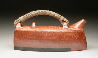
This is one of my 'lantern' pots. The shape of the body reminds me of old paper lanterns.

The design idea here is to make a pot that has been pared down to the most basic elements of form.


Every teapot has a personality.


A teapot is supposed to be the potter's thesis because of the complexity of aligning many small forms into a single pot for a specific function--the body, foot, lugs, handle, spout, the lid and galley, all must work in harmony to become a good pot.

And of these many elements, many variants must be considered:

The body shape.

The placement of the handle lugs, the placement of the spout.

The lid and galley.

Glazes inside and out

and much, much more.


Will the pot be functional or decorative?

Although most teapots are meant to be used, a teapot can serve as the basis for an art statement .

Pictured are Meryl Ruth's Purse teapots (L.). More of her work can be found on line. It is obvious with this pot that it is not meant to be used for making tea.


My pot on the right is designed to hold two cups of tea plus refills. It is definitely designed for tea.


If the pot is meant to be used, the artist must decide:

The foot: A round, trimmed foot? Legs? A pedestal, attached or a separate one? How about a constructed one?

The body and the brewing of tea: Overall shape: Round, oval, altered, flared at the bottom or top? Concave? Undulating? Grooved, lined or paddled?

Will the pot hold the heat?

What kind of glaze to use inside?

Make a clay strainer or keep the spout clear? Accommodate the use of a tea-ball? I've seen pots with little U-shaped holes in the rim of the lid-seat that will accommodate the string and tab of a teabag.

The lid and the release of steam: Even though the steam hole is traditionally placed in the lid, I have actually seen a pot with a tiny hole concealed in the lid seat. ( The steam hole must also be placed somewhere that will not allow steam to reach the hand that is pouring the tea.)

The action of the lid flange and the seat of the lid during pouring. Does it sit well? Will it have a notch and knob arrangement to keep the lid on when the pot is tipped up? Will the flange have a long bottom that catches on the lid rim and hold the lid?

Make a top knob on the lid or not? How will the knob relate to the rest of the pot? To the fingers?

The relationship between the lid, the lugs and the handle.

The lugs: Are they far enough apart to allow easy access to the lid? Are they in harmony with the overall design of the pot? Should they be? Do they sit up or out or in? Are they a different design/material than the usual lugs? Do you want them to be obvious or to "melt" into the body of the pot? Check out this great handle by Nils Lou.


Or this wonderful pot by Stephen Hill.


The spout: Large or small? Is the angle right? Does it dribble? What about the finish of the end of the spout? Rounded? A sharp, flat cut? Is the tip high enough to keep the tea concentrated at the spout and not leak from the lid when the tea is poured?

How the pot functions and handles: Is it too light or too heavy? Does it have a balance when you use it? Does it "feel" right when you pick it up and pour? Does it work on a purely functional level--is it really a working teapot? Does that matter? For instance, you can look at this one by Mel Jacobson and just know it will work well.


The consideration of additional forms to accompany the main form of a teapot such as a tray, creamer and sugar, mugs or cups. (I wish I knew who made this snuggley grouping of a pot, creamer and sugar.)


Or this great assemblage by Matt Wilt.


And here's a great pairing of a pot and cups by Diana Angel-Wing.


What firing method will be chosen? Wood or electric? Raku, reduced or oxidized?

What kind of finish for the outside? Glazed or burnished, poured or dipped, brushed or sprayed, carved or applied, printed or any other treatment?


And finally, after all these decisions and executions, the big question:

And does it work aesthetically? Is it an artistically pleasing unit?

Does it answer the questions of the eye?


Take a look at this absolute symphony of a teapot made by my friend Gail Bair. It's a virtual juggling act of many strong elements and skills melded into a wonderful balance and strong statement that happens to be a teapot. She does more of these and other great work.

You can see more of her work on www.claybair.com.


Look at this wonderful sculpture by Lisa Qualls from The Texas Teapot Tournament website www.cameohouston.org/pages/events/teapot.html
The 2010 show should be up soon. (previous shows in the gallery)


Sequoia Miller makes great teapots: www.sequoiamillerpottery.com

As does Ann Hirondale: This rather large pot on the left is surprisingly lightweight. Check out her amazing new work by googling her name.


There are lots of books on teapots and of course, the wonderful 500 series from Lark Publications of 500 Teapots.

The web is loaded with images of teapots.

Check out a blog devoted exclusively to teapots at: www.teapotsteapotsteapots.blogspot.com.

And for a really great tour of teapots and more, check out www.flickr.com/people/gusstiffpottery.

Or see www. strecker -nelsongallery.com/Artists_nu/Teapot/teapotSlideShow/index.htm, includes one of my favorite makers, Yokhi Ikeda.

The last 3 years of the Strictly Functional annual show,including teapots can be seen at www.art-craftpa.com/exhibit.html,