Wednesday, June 20, 2012

More Computer Graphics

Here's a business logo I designed a few years ago.

I used Superpaint to draw the hen, do the lettering and encircle the design.


So, the placement wasn't good. The hen is looking like she's going out of the frame--too forward. Nice relationship between the curve of the tail feathers and the back of the circle. So, I moved her back and gave her 'beak room.'


I began to play with the image. Putting an apron on the hen.  And what could be more appropriate for a hen than to change the circle to an egg shape?


Maybe the glasses is a bit too much.......

I always liked the story of the Little Red Hen. "I'll do it myself" as in the story was sort of my motto as a child.

 I once read that by knowing people's favorite children's story, you could gain some insight into their psyche. I've pretty well stuck to The Little Red Hen for sure. 

 The title, "The Little Red" Hen may be under copyright, so I probably can's use The Little part. 

Maybe I'll make labels for my elderberry jelly and sell it at the Farmer's Market....... 


Wednesday, June 13, 2012

More drawer rifling. Obviously, I'm on a cleaning jag.


From time to time, I've designed business cards using computer programs.

One beloved program which is sadly no more was SuperPaint, a simple design program that worked on (now) ancient Macintosh. It ceased to exist after 1992.

 I loved it.

 I made this using Super Paint:
And this:


(Yes, I have been in the antique business too. For several years, my husband and I did shows and had spaces in antique malls.)

When a few promo cards for a clay show came back because of a few  bad addresses, I cropped photos and stuck them in an envelope. Later,  I scanned one into my images program.

With a bit of tweeking, it might be handy later on a future card.


Saturday, June 2, 2012

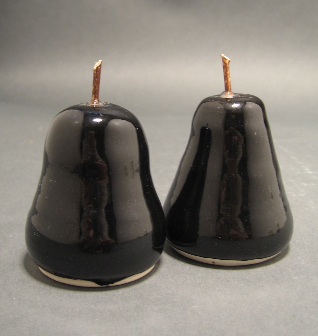
Salt & Pepper

Salt and peppers are among my favorite tableware pieces to make. 

I especially like the ones that distribute the salt and pepper from the bottom; the ones with no shaker holes in the top. 

Here are some examples of forms and glaze treatments: 


A pear-shaped form works best with this kind of design, but there are certainly lots of other interpretations to explore. 


Bamboo stems


My first attempt at making a set was thrown on the wheel with an opening in the top and a plug in the bottom.  (Blue for salt; red flame-like design for the pepper)


This is one of the first pear shakers I made. It has a very pleasing celadon glaze. Unfortunately, the stem snapped and has been glued back--so it's mine forever. 

This rather large shaker is by Paul Dresang. It is wood-fired. The photo doesn't really do it justice. 


I've shown these before. They are rather large shakers with top holes and bottom plugs. They are terra cotta with black underglaze stain highlights. The underglaze was applied while the shakers were still slightly damp.


And this is what we are doing about sea salt at the moment. This beautiful little bowl was bought at the Portland Showcase last month. It is a perfect compliment to the glittering salt crystals.

Maybe instead of shaking pepper, which can put it right up your nose, it would be better to spoon or pinch it out of a bowl like this one. Two shallow containers with lids???  Or maybe three or four conjoined containers for plain salt, sea salt, ground black and white pepper??


Monday, May 14, 2012

Who Does She Think She Is?


This film aired on PBS this weekend.   Although it was first aired in 2008, it addresses the dilemma of women artists both in regard to recognition and in the conflicts and pulls of home, children, partners and their art.

It hit the mark with examples of several women artists who have achieved recognition in their fields. For me, it was like getting a good thump in the chest.  (And also a good "kick up the backside" to get out there to my studio and get to work!)

An extensive showing schedule is posted on the website. Check it out.

Note: Although this is primarily a women's issue, men who stay at home can also feel these pressures of  guilt and duality upon their work.

Wednesday, May 9, 2012

OPA Showcase

Just came back from the Oregon Potters' Showcase in Portland.  This is one of the biggest and best shows of claywork in the country.  They are celebrating their 30th year of presenting one of the best organized shows in the country.

It was nice to see and chat with my friends in Oregon who had work in this show. And I finally met Ellen Currans. She has always been working in the background and never out on the floor, but this year she was at her booth and we had a good chat. I own a couple of pieces of her work and love them.

I didn't know it until the show that Ellen was one of the original innovators who organized the first shows. Check out the OPA website to read more.

Ellen makes beautiful functional pieces and she is a master of glaze as well.


Here's a few examples from the member's show gallery.  (I usually don't photograph work in the individual booths unless I get the owner's permission.)


This photo is to remind me to return to the indigo lined work I did with my cat plates. It looks very ease, but believe me, it's tough to do this and do it so well as this example.


Note to self:  Look for innovative handle applications.


This is a LAMP. It is stunning in real life. Wish I could have seen it illuminated.


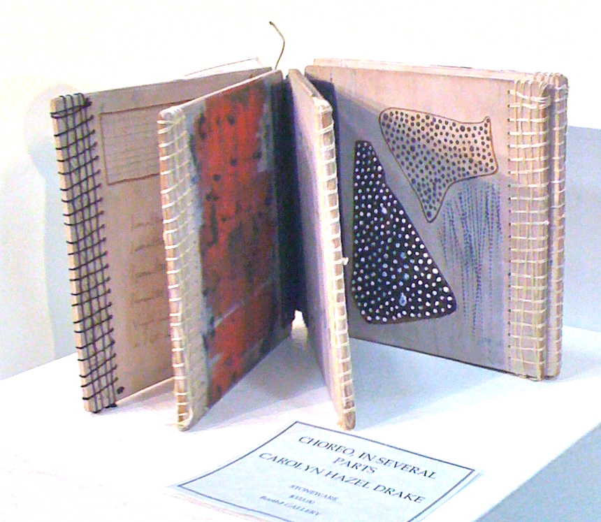
Book pages of clay. You wanted to pick it up and thumb through the pages.

The elements here are all 3-D. A novel way to present clay.


Beautifully carved - a very large platter.


This was also a large piece.  I must give this technique a try some day.


I selected these pieces because of the innovation and originality of work; reminders of techniques to experiment with.  Although I seem to be seeing more sculptural work as a trend, I also had the impression that brighter, more ornate work is also happening.

I can't say I am a fan of the bright colored grotesque sculpture that seems to be emerging in a lot of the shows. Looking at the posted NCECA gallery shots, these type of sculptures seem to be prevalent. 

There were more iridescent glazes it seemed and some fine crystal growing going on.  I'm a sucker for white crystalline pieces.

Once again, I added more bowls to my growing collection. I was conscious of the pull of oriental-inspired work that speaks to my own taste.


Tuesday, May 1, 2012

Another Lid Solution

I love this little pot.

Unfortunately, I dropped it's lid on the studio floor.

But here's another pot/lid marriage. And it's a funny one because the 'lid' started out as a tiny teacup. It still has wax on the bottom.

I will put it into a bisque kiln and burn the wax off.


This time, I'll find a trivet to go with the teapot and glaze it to match the lid.

Maybe a chocolate brown would work well.

Thursday, April 26, 2012

Specialized Lids - Tea Balls


Some tea drinkers like to steep loose tea leaves in the little metal tea balls attached by a chain to a hook. Here's a couple of lids designed with an inside loop that will take a tea ball hook.


When I sell these teapots, I always include the teaball. They are inexpensive and can be bought in bulk from suppliers.

Another thing a potter can do that commercial tea pot manufacturers don't do is make a matching tea bag saucer to go with the pot. It's just a nice touch. 

Sunday, April 22, 2012

Lids and More Lids

When I make something like a covered jar or teapot, I always make two lids at least. Usually in two different styles.
Sometimes a pot can be spoiled by a lid failure--it warps, the glaze doesn't work, the lid gets dropped, etc.

By making two lids in the first place, there is always got another one to fall back on.

So, after a while, I have a lot of different kinds of lids. And most of them are just about the same sizes too.

I tend to make 3 to 4 inch openings on teapots. So after looking at the lids today, I am thinking if I made uniform openings, I would have a lot more interchangeable lids.

Take the the short teapot in the picture, for instance.  This time I made only one lid. And I wasn't all that happy with it.


While checking out my lid stash, I found one I like a lot better. It's a little loose, so I'm thinking when the pot is glazed and fired, the alternate lid should fit well. I'll have to fire it on a stilt since it has glaze already.

The glaze is an iron glaze. I had planned to make this pot totally black.

But, I like the lid so much, I think I'll tweek the whole glaze plan and lay down some subtle layers of iron first, then glaze with black. I'll put another layer of black glaze on the lid.

It should be interesting....

Wednesday, April 11, 2012

Why is it? (Fits and Starts)


Why is it that at some times, you can waltz out to your studio, wire off an 8 lb. chunk of clay, sit down and throw a 14 inch platter with no trouble at all?

And other times, you can't get anything to work.

Or worse yet, can't think of anything you want to make.

Or you can look at a piece of greenware and see several versions of glaze application and yet, at other times, you let the piece sit on the shelf gathering dust and can't think of a single way to decorate it?

Lately, I've been zipping off platters like there's no tomorrow and last night, just before going to sleep, I came up with several variations for underglaze.

Friday, March 30, 2012

Scrap Clay Sculpture


While cleaning up my studio today, I noticed this in my scrap clay bin.

It was a teapot body pushed too far. (Yes, I have that problem) with the additional blops and rim trimmings dropped on top at random.

I hadn't noticed it until now. But, as I looked at it, I realized it was really interesting.

Especially since I have been seeing photos of pieces very similar to this, glaze fired and mounted, placed on stands and displayed in galleries.

What do you think? Maybe a nice white semi matt? Black square base?

Maybe I'll stick it into the next bisque fire.