This blog will go on WalkAbout for about 2 weeks while I transition to sunnier climes.
I'll be relocating my clay workspace too, which may take a bit of time to get everything up and going. Really looking forward to it.
See ya soon!

 Level - Perfect for keeping everything square and level. Especially when hand building something. You can suspend this light-weight level in the center of a plastic ruler and make certain the top rim of anything is level and true with the other side. I sometimes use it on the wheel too. Of course my wheel is absolutely level, but it's nice to double check the top edge of things.
 Graduated Hole Cutters - Bought these in Japan. Musta' walked a mile off somewhere into the boonies and rice paddies to a building loaded with clay goodies. (Where the heck was that, Rick Mchaffey?) I guard them with my life, since I only have one set. They always go right back into the plastic sleeve they came in when I'm finished. You can see how small the gradation goes down to. You could almost do something intravenous with the smallest one, I swear. Have never used it, but have certainly used the larger ones. They are very sharp.
 Bison Tools - Absolutely the best trimming tools going. Beautiful, easy, comfortable handles. This is a few of the ones I use. Wonderfully handmade tools by master toolmaker, Phil Poburka, You can find them at www.bisonstudios.com. You can find Phil at bisonstudios.blogspot.com.

 Thinking further about Mueck's work and his use of scale:
 Once I came across a house-sized painting done completely in grey. That is, the entire canvas seemed to be nothing but grey. I started to walk on further when something tugged at me. I stood a distance away and began to study, to look at the canvas. It dawned on me that it was really an impressive exersize in the manipulation of color. One upper corner began with a medium dark, very warm grey and this pigment progressed diagionally across the canvas to the opposite lower corner resolving in a cool grey. The exact reverse process was going on from the opposite upper corner to the opposite lower corner. In other words, the artist had controlled the tint of grey creating a gigantic X with all the subtle gradations of grey from warm to cool and presented an absolute, totally neutral grey in the center. And no stumbling on the way, it was a mastery of tone as well as tint.
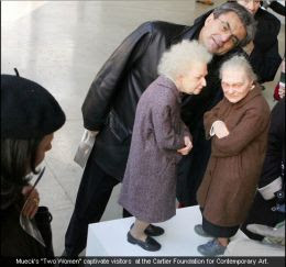
 Murek's work demands you look at it. First, because it has the impact of easily recognizable forms. Second because it is hyper-realizm--just about as close to 'real' as you can get. And third because it is presented in either in gigantic or miniature form.
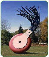
 I always have to chuckle at the huge typewriter eraser that's installed at the end of the Mall in D.C. It's a great combination of forms. It's taking something that is mundane and makes it monumental and it's also amusing because I think of all the pages of type that has flowed out of all those buildings for all those years. How many of those erasers have been applied to paper in that few square miles?
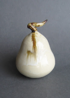
 Sometimes art means no more than, "Here's a beautiful pear".
 I mean, why bother with compasses, folding paper and using scissors when perfect patterns are available everywhere around you? (This is cooking directions in a pizza dough package.)
 I just discovered the work of Ron Mueck, a hyper-realistic sculpture who works in fiberglass and silicon. His figures are so realistic, you expect them to breathe.
 Michelangelo's 'David' is like that. When I walked into the room where David stands in Florence, I realized I was holding my breath, unconsciously at first, waiting for him to breathe.
 But I was talking about Ron Mueck. And Mueck creates extremely realistic figures. His attention to detail is incredible. This is intriguing enough to make us look closely at his work, but he does yet another thing to further focus our attention. He changes the scale of his subjects to either 1/2 to 1/3 size of the real thing or he builds giants.
 A 30 minute video located at blip.tv/file94203 shows the process of making the figures.
 This small bowl looks much better in reality than in photos. I've nicknamed it 'graceful'. I love the curvy shape. This bowl is relatively small--about 6 inches at it's widest.
 Photographing this piece is a real headache. Something happens when a round object gets translated into a flat image by a camera lens. There's a very subtle distortion going on.
 p