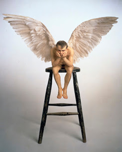
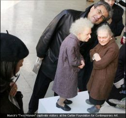
 Thinking further about Mueck's work and his use of scale:
Most of us look at something in a cursory way in order to identify what it is. I think we're wired to do just that. It may be a function of survival to instantly recognize our surroundings and be sensitive to things if they don't appear 'normal'.
So many of us don't really look at things; study them, see the shape, the color the surrounding background as it relates to the object. See the line, mass, composition, structure, light and shade or the movement of muscles, bones, fabric, leaves etc.
It's interesting to be in a museum gallery full of abstracts and listen to what people say to one another. I've heard them say something like, "Oh, that's clouds and a river." in order to organize what they are seeing into something recognizable. I've even heard women say, "I'd like to have a living room that color", looking at an abstract painting. So there's all kinds of ways for people to 'see' and interpret.
It's been my observation that hardly anyone sits on a museum bench spending a long time looking at an abstract painting. They usually stroll rather quickly through these large rooms devoted to 4 or 5 large pieces.
Segway Allert:
 Once I came across a house-sized painting done completely in grey. That is, the entire canvas seemed to be nothing but grey. I started to walk on further when something tugged at me. I stood a distance away and began to study, to look at the canvas. It dawned on me that it was really an impressive exersize in the manipulation of color. One upper corner began with a medium dark, very warm grey and this pigment progressed diagionally across the canvas to the opposite lower corner resolving in a cool grey. The exact reverse process was going on from the opposite upper corner to the opposite lower corner. In other words, the artist had controlled the tint of grey creating a gigantic X with all the subtle gradations of grey from warm to cool and presented an absolute, totally neutral grey in the center. And no stumbling on the way, it was a mastery of tone as well as tint.
A man walked up to me and asked, "I've noticed you looking at this painting for a long tiime, may I ask you what you are seeing in it? I can't understand it." When I pointed out to him what was going on, he was amazed when he began to realize the skill it took to pull the thing off.
Museum goers will, however, sit and look at a Victorian work chocked full of things or a large, heroic painting of a battle, an intricately painted still life, an exquisitely painted portrait of someone in an elaborate costume. That isn't to say one is good and the other is bad. The intent of the work results in the response of the viewer a lot of times. Abstract work can create a mood, an emotional response while an intricate painting like one by Brugel for instance, can be filled with symbols, myths, parables, puzzles, allegory and illicit a completely different response from viewers.
Art can be as different as a poem is from a textbook.
 Murek's work demands you look at it. First, because it has the impact of easily recognizable forms. Second because it is hyper-realizm--just about as close to 'real' as you can get. And third because it is presented in either in gigantic or miniature form.
A work in miniature focuses the attention on the object. We are compelled to try to see if the miniature is as good as or equal to the full-sized object. When the work is enlarged, the same effect happens. But, as in the case of Murek's work, the piece gains presence; translated into gigantic form makes use of a kind of 'awe' effect comes into play as well.
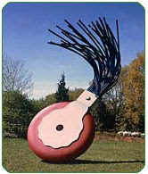
 I always have to chuckle at the huge typewriter eraser that's installed at the end of the Mall in D.C. It's a great combination of forms. It's taking something that is mundane and makes it monumental and it's also amusing because I think of all the pages of type that has flowed out of all those buildings for all those years. How many of those erasers have been applied to paper in that few square miles?
If you saw a typewriter eraser on the sidewalk, you would hardly give it a thought or even look at it except to think, "It's an eraser." Seeing one that must be 15 feet high is another thing entirely.
Moving sculpture, walk-through installations, drastically altered common things, shocking things, distortion, using multiples to create texture are some of the things artists use to make the viewer "see" in a new way.
Historically, much of art has been about the capturing of realism. The more convincing an image, the better the art. That is until artists began to shake thing up with what one historian has labeled "The Shock of the New". New ways of painting light. New materials to work with. Using art to send a message. (Although the religious art of antiquity certainly had it's message too). Methods of gaining fame by scandalizing, shocking, or upsetting viewers. There's lots of devices to manipulate the work and the viewers.
It is communication, but visual and mental. It bypasses language. It's a mysterious thing because it is all bound up in perception; the artist's and the viewers. I think art speaks to people in unique and individual ways, on so many levels of consciousness. That's why it's so difficult to pin down into language.
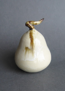
 Sometimes art means no more than, "Here's a beautiful pear".

No comments:
Post a Comment