Showing posts with label aesthetics. Show all posts
Showing posts with label aesthetics. Show all posts
Saturday, January 2, 2016
Handles
Handles are an interesting aspect of clay.
 Here's an early experiment with thinking 'way outside the box for a handle which actually acts as a sculptural component.
Sunday, April 5, 2015
Mystery Teapot

Unfortunately at the time, I couldn't find the maker's identity.
I included it in the post anyway because it's such a great piece.
I like the lovely glaze variation. There's lots of planes and surfaces to show it off.
Three oval loops - each an individual statement, yet relating nicely in oval form to each other and giving a wholeness to the piece.
Round-y additions that pop the mass and give references to each other, moving the eye. The bold statement of the spout.
Design rule going on here is 3 oval elements; 3 rounds and one strong variation.
Today, the maker of the pot contacted me. She is a potter who works in St. Louis and her name is Yael Shomnoni. You can see more of her work at http://www.yaelshomronipottery.com.
Nice to hear from you, Yael, Great Work!
Saturday, October 11, 2014
Playing Around with Design
Even though I don't have a studio right now, I never stop thinking and studying ceramics.
Some time ago, I made small templates of basic forms: Round and square plates. The forms are small enough to dash off a sketch or toy around with a design and variation. I can run off a copy on my printer and expand the idea or upload it into my computer.
Here's an example:


The first one is a bit busy on the right side. And I would remove the small connecting lines at the bottom of the branch like figures.
All in all, I think this would make a good wax resist platter. It would be interesting to try this in scraffito too.

Here's a positive and negative of the same drawing. (The darker snake is the original drawing.) Although the snake image is about the same, the second image seems more of a 'fat snake'.

The third variation seems more dynamic just by adding another outline.

Monday, October 28, 2013
Interpretation
Featured Tiles: I like to think of this set of tiles as an example of relationships:
The tile on the left is the opening statement: "This is what I am; This is the standard."

The tile on the right is a variation or response: It takes the example of the above and elaborates as if it were saying, "I accept your statement and respond. I am an elaboration of you." Or, "I see your bid and raise you one."
Also working in this design dynamic is the shape and strong black framing of both tiles, bouncing the eye back and forth toward the center. The outer curves work in the same way, leading the eye back and forth between the tile: The left tile has a larger outer margin on the far left; the right tile sweeps toward the far right border, but a similar strong outer border on the right and the strong vertical in the center of the image stops the eye at the far right.
The tree-like center designs are isolated as images, but relate to each other in motion toward the center, also bouncing the eye back and forth, yet slowing the flow by corresponding dark verticals.
How wide the center division between the two tiles is also important. If hung too widely apart, this dynamic would not work as well.
I don't think these things as I am working. These design elements are almost subconscious and are part of an artist's "eye". They either look right or they don't.
This same back and forth happens a lot in music: Theme and Variation and so it can be in clay.

These guys are fun to move around to get different impressions.
Monday, August 12, 2013
Medium and Large Sized Bowls
Seems as though people make either small bowls or really big bowls. I hardly see medium bowls at shows. Yet, these bowls are sometimes the most useful.
It may have to do with kiln fit--small bowls can be placed around the perimeter; big bowls take a lot of kiln room, but are more impressive and therefore can be more expensive. Medium bowls are sort of misfits.
"Geographic Bowl"
This is a bowl I made in another studio setting than my own. It was an experiment with a different clay and different studio glazes. It's good to work with unfamiliar materials sometimes.
(Unfortunately, it is no more--lost when we had the flood and the packers didn't know how to pack pottery.)
It was about 6-7 inches across and of medium depth. Very handy size.


 "Gold Leaf Demo"
I love this bowl. It's totally useless, but I just like to look at it.
I was doing a demo about how to apply gold leaf and used this earthenware bowl to show the contrast in surfaces.
Come to think of it, since this is a non-utilitarian bowl, I wonder if another surface application like acrylic paint would be added to either the leaf or sealed earthenware???
Could be interesting.
 Here's where painting with glaze works. The base is a yellow matt glaze. I decided to add green organic-like leafy applications and then use a stain for the darker cobalt blue and brown accents.


It may have to do with kiln fit--small bowls can be placed around the perimeter; big bowls take a lot of kiln room, but are more impressive and therefore can be more expensive. Medium bowls are sort of misfits.
"Geographic Bowl"
This is a bowl I made in another studio setting than my own. It was an experiment with a different clay and different studio glazes. It's good to work with unfamiliar materials sometimes.
(Unfortunately, it is no more--lost when we had the flood and the packers didn't know how to pack pottery.)
It was about 6-7 inches across and of medium depth. Very handy size.

"Snowflake Bowl"
This is another glaze test mostly. And it is a slightly bigger and deeper bowl than the previous one. The white glaze was poured in first, then the maroon glaze rolled around the rim. Great contrast where both glazes overlapped and were poured out.


I love this bowl. It's totally useless, but I just like to look at it.
I was doing a demo about how to apply gold leaf and used this earthenware bowl to show the contrast in surfaces.
Come to think of it, since this is a non-utilitarian bowl, I wonder if another surface application like acrylic paint would be added to either the leaf or sealed earthenware???
Could be interesting.
"Flower Bowl"
 Here's where painting with glaze works. The base is a yellow matt glaze. I decided to add green organic-like leafy applications and then use a stain for the darker cobalt blue and brown accents.
This is a medium to large bowl, quite shallow, but with a larger circumference. This bowl barely left my hand in one of my first shows when it was snapped up.
"Great Wall of China"
This very large bowl was a challenge. It is a monster. All hand-formed, it was made using a big, awful orange plastic mid-century salad bowl as a mold for the top and a paper pattern for the base. I worried quite a lot about getting a good fit between the two parts and about firing it, but it all went well. This piece is still in my collection. It is worth an encore, I think.
The glaze is Coyote Shino. It was murder to glaze; very cumbersome.

"Big X Bowl"
A very early piece, this is another bowl made using hand building over a form. Early in my claywork, I used mostly white or clear glazes, focusing mainly on form. It was quite large. The black glaze was slapped on using a big paintbrush. A second layer of a plumb brown glaze was laid on over that with a smaller brush.
I made this after working on another piece that required very detailed and meticulous work. It's good to lash out on something else a bit, just to release that energy.

Not pictured here are bowls made using a blowtorch while throwing on the wheel to hasten the drying of the clay. Although a bit frightening at first, the Ken Turner workshop I took some years ago dispelled all that fear and I love to make whopper bowls using this method. Ken is doing a workshop on foil sagger firings right now. You can find him on the web.
The good thing about medium to large bowls is the opportunity to work with a bigger pallet and surface; make a bolder and a more eloquent statement. And, as in the "Snow Bowl" and the "Flower Bowl" expand experiments on a larger surface.
Sunday, January 13, 2013
What a Beauty
I wish I knew who made this beautiful plate.


Just two simple treatments. And they work so well together.
P.S. Getting over the flu/Valley Fever/Cold/Mung/Whatever. Been pooped out for weeks.
Sunday, September 30, 2012
Theme and Variation
It's amazing how a surface can make the same thing look so different.
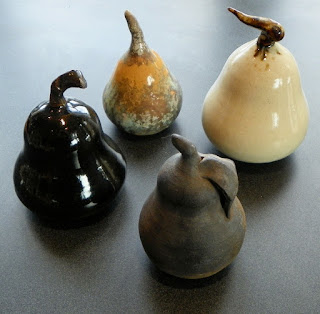
Sometimes, I make these to use as salt and peppers. (However, salt and peppers have a totally different interior construction.)
The white pear glaze is just pure white with an iron-based stem glaze that was encouraged to run.
The matt black was a smoke fired piece which feels wonderful in your hand.
And the shiny black was a glaze test for this delightful glaze.
The smallest pear is a multiple finish: A basic white with a pumpkin glaze and touches of turquoise glaze. An oxide was applied and then an adhesive for random additions of gold foil. (Sometimes it's good to go 'way out on a limb.)
It garnered a prize in a Seattle show.


These pears were made to be purely decorative.
Sometimes, I make these to use as salt and peppers. (However, salt and peppers have a totally different interior construction.)
The white pear glaze is just pure white with an iron-based stem glaze that was encouraged to run.
The matt black was a smoke fired piece which feels wonderful in your hand.
And the shiny black was a glaze test for this delightful glaze.
The smallest pear is a multiple finish: A basic white with a pumpkin glaze and touches of turquoise glaze. An oxide was applied and then an adhesive for random additions of gold foil. (Sometimes it's good to go 'way out on a limb.)
It garnered a prize in a Seattle show.


I like pears so much, I even make velvet pincushions.

Sunday, April 22, 2012
Lids and More Lids
When I make something like a covered jar or teapot, I always make two lids at least. Usually in two different styles.
 Sometimes a pot can be spoiled by a lid failure--it warps, the glaze doesn't work, the lid gets dropped, etc.
By making two lids in the first place, there is always got another one to fall back on.
So, after a while, I have a lot of different kinds of lids. And most of them are just about the same sizes too.
I tend to make 3 to 4 inch openings on teapots. So after looking at the lids today, I am thinking if I made uniform openings, I would have a lot more interchangeable lids.
Take the the short teapot in the picture, for instance. This time I made only one lid. And I wasn't all that happy with it.

While checking out my lid stash, I found one I like a lot better. It's a little loose, so I'm thinking when the pot is glazed and fired, the alternate lid should fit well. I'll have to fire it on a stilt since it has glaze already.
The glaze is an iron glaze. I had planned to make this pot totally black.
But, I like the lid so much, I think I'll tweek the whole glaze plan and lay down some subtle layers of iron first, then glaze with black. I'll put another layer of black glaze on the lid.
It should be interesting....
Thursday, February 16, 2012
Eye Candy


A follow-up of the previous post, here's a website that is pure design and form.
There isn't a single thing here that I don't admire and love.
Inspiring and beautiful, the presentation of sculpture and objects is done wonderfully with the use of stands that enhance the object.
Copyright © 2008 Lamont Design Company All rights reserved.
The website design isn't bad either, by the way.
Saturday, February 4, 2012
Wow and Not So Wow

The same blog that presented the wonderful Wedgwood ewers in the original WOW post, did a follow-up with a second version of the pieces.
Not so impressive.
Lesson being: Form is one thing; interpretation is totally another.
Tuesday, October 11, 2011
Tea for One

I ran across this great teapot, cup, creamer and sugar listed in the FDIM Museum (Fashion Institute of Design & Merchandising in L. A.) gift shop. https://thefidmmuseumstore.org/
Great arrangement of sugar (on top), creamer, mug and tea/coffee pot.
A real challenge to get all the diameters made so the entire piece interlocks!
The rest of the items are worth a peruse too.
Monday, August 22, 2011
Inspiration

I ran across this on the web the other day.
It really hit my eye.
At first glance, I thought, "Round picture frame."
It is not that, but my mind went spinning into design mode and I saw this wonderful charger with a plain center and a highly decorated curved rim.
It is a form I've done before experimentally, a large plate with a curved down rim. But I have not made one with the plain center and ornate rim.
I'm clipping this as a springboard to tack up on the wall of the studio. A reminder of the next project, perhaps.
Now the full story--
It's an antique silver Japanese incense jar. The first photo was an overhead shot showing the bottom and rim of the piece.

Not a bad form either.
On the whole, Japanese silver is underrated and under priced. Only recently has it come into it's own as valuable pieces.
Same goes for Mexican silver. The quality is high in silver content in both productions, but until the value of silver began to go up, the work had little attention except for affectionados.
Monday, July 18, 2011
Two Pitchers

More from my files:
I often wonder if pitchers are going to be a thing of the past. At one show I where I had a booth, a potter remarked to me that the younger generation hardly knows what they are.
If you think about it, we don't use pitchers nearly as much as earlier generations did.
Nearly all our liquids come in either plastic or cardboard-like boxes.
These two pitchers are literally worlds apart.
The Chinese one looks like castle walls, roof tiles, curly toed boots and heavy fur-lined coats. I find it interesting that the structure above the handle serves no purpose except decoration. The pitcher is solid. straightforward and no nonsense. I also like the idea of the lid.
The glaze is perfect for the form.
This pitcher is all elegance and practicality at the same time. It is designed to hold a lot of liquid.
The spout would certainly pour and do that generously. I'm guessing it is a large piece meant to hold water or a liquid that would be used liberally. It's primary use was probably for water.
The handle is hefty, yet very decorative. It's almost too light for the rest of the vessel. Because it is decorated in a reference to a dog head, I would guess it was made in either France or Germany, since both those countries used that motif in their handles.
The design touch of banding serves as to emphasize the wonderful curve of the pouring lip, the roundness of the body. What an elegant piece.
Charmer

Since I can't get to my studio to work, I thought I'd share a few pictures of pots I've grabbed off the web to dream over.*
This little gem comes with not much information. All the information is in what the eye can see.
It's either Japanese or made during the period of high influence from Japan and China. You can guess just by looking at it that it isn't large; it's probably very light in the hand.
This little gem comes with not much information. All the information is in what the eye can see.
It's either Japanese or made during the period of high influence from Japan and China. You can guess just by looking at it that it isn't large; it's probably very light in the hand.
It's interesting both in form and decoration. The piece probably was mold-made. It is more than likely porcelain and has an applied lid knob and handle. The triangular shape is unique.
Two things tip you off to know it's made in the East: The side-mount handle and the spout, which hearkens to saki-pot pourers.
Just look at that glaze design! Almost like someone had taken glue and layered the pot with fine brocade. And what a sensitive bounce of bluish white and dark navy. That fine white line all around the rim sets off and calls attention to the triangular shape. A sensitive design element that adds grace to the pot.
How I would love to handle this pot. To turn it over and see what the base looks like, what clay was used, to try pouring out of it. (Although you already know it would do an excellent job with nary a drip.)
What an inspiration to use for shape and decoration.
*If you have a Mac, it's easy to click on a jpeg, drag it to the desktop, let it go. It will sit there waiting to be opened or drug into another folder to be stored for later viewing. I usually re-name the file as a memory aid, or if I know who made the piece, the artist's name.
Monday, May 30, 2011
Being Loose


Sometimes, when it doesn't count, when there's no pressure, when it's "Let's just see what happens"....... wonderful things can happen.


That's just what happened with this little trivet.
I was busy teaching myself how to throw an upside-down trivet.
I made essentially a bowl with an exaggerated bottom that was thicker than usual. I extended bottom rim and brought up the sides and turned the top edge outward, making a convex shape.
I let it sit on the batt until it was dry enough to take off. I turned it over, trimmed the (now) top to recess the surface and create a slightly higher rolled edge.
Then I cut into the sides of the bowl to make 4 feet, rolled worms to support them and let the whole thing dry.


It warped slightly during the bisque firing, but I kept it for a test piece anyway.
I dipped it in white glaze, dipped a big brush into watered down cobalt stain and just let the brush dance. I was thinking Sandy Brown. http://www.sandybrownarts.com/sandybrownarts.htm


During the firing, the stain went nuts. It popped all over the place making a lightly dotted patterns all over the white glaze.
Lessons learned.
Give a piece strong enough legs so it won't warp in the bisque firing.
Don't use straight cobalt stain.
It's possible to throw a trivet upside down with little trimming and alteration.
Big brushes and a fast and loose application makes a piece that comes alive.
Tuesday, March 29, 2011
Sloshing Glaze


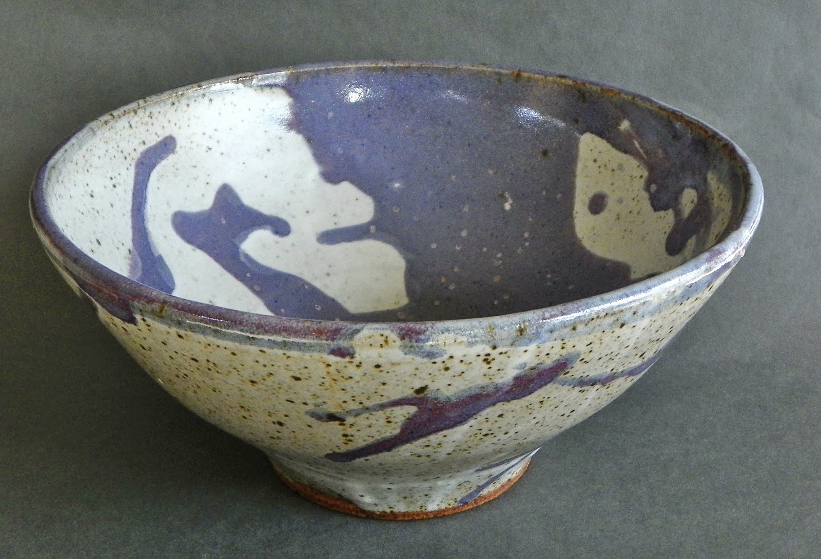


Sometimes, it's good to slosh glaze.
Here's a stoneware bowl, reduction fired, that I made during a class.
I was in the class because at the time I didn't have my home studio set up then.
Thankfully, the instructor excused me from most of the participation and just let me work.
Using glazes I was totally unfamiliar with and had no clue how they would turn out, I decided to do the "Ink Blot" approach and put a base glaze on, then slosh a contrasting one over the top, rotating the bowl to make it run in interesting patterns.
I think the purple glaze was called "Fish Guts" or something.
Not for the faint of heart.
Subscribe to:
Posts (Atom)