Monday, February 4, 2013
I'm super excited about the finding of Richard III's bones. Since I started chasing ancestors, I've found many lines back to the Plantagenet family.
Although mine had moved out of the powerful mainstream by the time Richard came around, they were lesser to minor royals by then.
Records were well preserved within the titled people, so if you find a solid link, it's not that hard to go back to the Conqueror. And his line goes back to Charlemagne. Even then, it's not that unusual to discover the descent--probably half of Europe could do this.
What I did find amazing is the huge number of French, Spanish, Russian, Scandinavian, Irish and Scots I've found. Even links to the real Blackadder family in Scotland!
All just on my mother's side.
Can't wait to see what Richard really looked like.
And I hope they also test the little skeletons found under the stairs in the Tower. Now it's going to be easier to identify them for sure.
Labels:
archeology,
brush with fame,
Genealogy,
history
Saturday, February 2, 2013
Washington Clay Association 2013 Calendar
Great Job on the 2013 WCA Calendar!
Bezalel, Chaim
Ben Levy, Yonnah
Bushnell, Judith
Buss, Mary Lynn
Chapman, Linda Collins
Conrow, Ginny
Cooper, Ann Marie
Dahl, Dirk
Daniels, Lee
Duarte, Liz
Feng, Anita
Freuen, Gina
Funderburgh, Eva
Gale, Diane
Garrity, Wanda
Gouthro, Carol
Grava, Damian
Harris, Jeanette
Holly, Lin
Lindsey, June
Lewing, Paul
Lobb, James
Lurie, Gale
Mander, Sandra
Moore, Allison
Newman, Eric
Roberts, Inge
Rodriguez, George'
Romm, Sharon
Sachar, Charan
Sauer, Steve
Schwartzkopf, Deb
Thompson, Susan
Copies will be available at Seattle Pottery Supply and at Clay Art Center in Tacoma.
P.S. My work is the black coffee pot in the upper right corner.
Thursday, January 31, 2013
Intriguing Image
I've had this jpeg knocking around on my desktop for some time now.
Don't know the origin, but I find it an interesting idea. What is conveyed is a message of anxiety. The facial expression; a Madonna-ish moulding of the face reminescent of early Spanish alter pieces. The position of the shoulders and arms, especially the slightly off-kilter of the neck and shoulders showing uncertainty; the hands. The stiffness of the posture, the starkness of the clothing treatment, all these elements instantly telegraph worry, dread, a holding in, restraint, correctness, stress.
I'm reminded of the Renaissance busts of young women and old dolls. And although they don't show the emotion that this image does, the appearance is similar.
I wonder if I could make one like this, but in my own style. Maybe not life size, as I feel this one must be. I would probably make one that would be a little easier to live with......
How would I construct it? The balance would be tricky to say nothing of the process of drying it without cracks. Maybe not so much body, thicker arms (and a less worried expression) would be a workable modification of the idea.
Maybe the trick of attacking it to a clay backing in exaggerated bas relief would work.
Or, as one clay figure sculpture artist I know dose it, make components that are later attached together on a support concealed inside. Like the places where clothing overlaps the figure.
And maybe a watercolor-y surface treatment.

I'm thinking a small experimental try would be the best.
Don't know the origin, but I find it an interesting idea. What is conveyed is a message of anxiety. The facial expression; a Madonna-ish moulding of the face reminescent of early Spanish alter pieces. The position of the shoulders and arms, especially the slightly off-kilter of the neck and shoulders showing uncertainty; the hands. The stiffness of the posture, the starkness of the clothing treatment, all these elements instantly telegraph worry, dread, a holding in, restraint, correctness, stress.
I wonder if I could make one like this, but in my own style. Maybe not life size, as I feel this one must be. I would probably make one that would be a little easier to live with......
How would I construct it? The balance would be tricky to say nothing of the process of drying it without cracks. Maybe not so much body, thicker arms (and a less worried expression) would be a workable modification of the idea.
Maybe the trick of attacking it to a clay backing in exaggerated bas relief would work.
Or, as one clay figure sculpture artist I know dose it, make components that are later attached together on a support concealed inside. Like the places where clothing overlaps the figure.
And maybe a watercolor-y surface treatment.

Sunday, January 13, 2013
What a Beauty
I wish I knew who made this beautiful plate.
Just two simple treatments. And they work so well together.
P.S. Getting over the flu/Valley Fever/Cold/Mung/Whatever. Been pooped out for weeks.
Labels:
aesthetics,
Blanc de Chine,
design,
tableware
Tuesday, January 8, 2013
And now for something completely different......
Sometimes, It is good to be a hoarder:
Necklace componants:
Mother of pearl antique belt buckle.
Mother of pearl beads, buttons.
Agate beads.
Faux pearls
Real pearls
Glass beads
Seed pods
Wooden beads
Coconut shell beads and buttons
Shell beads
Brass beads and tiny brass bell
Moon stone beads
And for spice: Black onyx and glass beads
Labels:
antiques,
Beads,
collecting,
design,
hoarding,
jewelry,
segways,
wearable art
Tuesday, January 1, 2013
New Year, New Post, New Resolutions
My list on Amazon grows.
2. I will listen to more music. Music lifts my soul and my mood. I must remember to give myself that gift more often.
3. Since I sent no Holiday greetings this year, I will write a short or long note to everyone who wished
me well.
This Holiday, I was working on my immunity to the flu...... The hard way....... One microbe at a
time....... Flat on my back and basically oblivious to most things.
4. I will prove my ancestor, John Wood, the Mariner is the same man who died in the Battle of
Levorno, Italy or Leghorn, as the English say. And I will get everything I know about him to date down on paper.
5. I will write the stories of my family and about the funny things that happened to me while living in many different places.
6. I will expand my art to more expressions: Clay, sculpture, paintings, drawings and fibers.
Wow. Once I wrote all that down, it looks like a lot.
Tuesday, December 11, 2012
Early Resolutions
Wow
I just finished have a big old clean-out of my studio; the place where I've been making claywork for about 25 years.
Amazing what you can accumulate......
Like twidgets that might look good on a ray gun.
Or a piece of beautifully oxidized copper tubing that might have possibilities for a handle.
I won't mention the amount of driftwood I've stocked up on
or round beach rocks and shells....
It's just as bad in my house. So these last 10 days or so, I've been sorting, grouping, pricing, advertising and hosting a big sale of things I probably will never use.
One must close one's eyes, extend the hand and arm, and drop whatever it is in the "For Sale" box. Ouch!
I realized that I was holding onto a newly designed lid here or a teapot there that didn't fire right but had a great glaze. And the reason why these were hanging around is because I wanted to remind myself to try it again.
(Palm to forehead) I Can Take A Picture of It and transfer it to a page labeled "Reminders." Much more sensible. And a heck of a lot less space.
But I did have a happy trip to the bank.
Next: Thin out those image files and "those-stacks-of--articles-I-need to-read!!!
Friday, November 30, 2012
Monoprints
Have you ever made a monoprint? They are easy to do and an interesting exercise in drawing.
What you need is an absorbent paper, a pencil, ink and a glass surface.
Brayer out the ink on the glass to a consistent coating. Slightly dampen the paper and lay it over the ink surface making sure there aren't any air bubbles, but do not rub the paper. Tricky, but easy to get the hang thereof.
For these drawings, I used some printing ink from the tail-end of a tube that was going to be thrown out after an art class. (We will discuss art hoarding at another time. )
After you get the ink-glass-paper setup, begin drawing free hand to the paper surface. Press firmly to make sure the pencil strokes will transfer to the underside of the paper. Light rubbing is now permitted if you think it will add anything to the picture. You will know how this will work after you've done a few drawings.
When you are finished, carefully peel the paper off the ink ground.
Here's two drawings I made from some left-over newsprint, left-over ink and a piece of picture frame glass. (Now I wish I had used better paper, but there it is.)
The resultant art work has a very distinctive look and will come out reversed-image. Which may be a surprise to you and may make you correct some drawing idiosyncrasies you may have and didn't know about until then.

This drawing was done years before I lived in Bahrain and actually saw scenes like this. Sights like this was very common and would not depict people who were destitute or empoverished. It could very well be village women in town with items to sell.
What you need is an absorbent paper, a pencil, ink and a glass surface.
Brayer out the ink on the glass to a consistent coating. Slightly dampen the paper and lay it over the ink surface making sure there aren't any air bubbles, but do not rub the paper. Tricky, but easy to get the hang thereof.
For these drawings, I used some printing ink from the tail-end of a tube that was going to be thrown out after an art class. (We will discuss art hoarding at another time. )
After you get the ink-glass-paper setup, begin drawing free hand to the paper surface. Press firmly to make sure the pencil strokes will transfer to the underside of the paper. Light rubbing is now permitted if you think it will add anything to the picture. You will know how this will work after you've done a few drawings.
When you are finished, carefully peel the paper off the ink ground.
Here's two drawings I made from some left-over newsprint, left-over ink and a piece of picture frame glass. (Now I wish I had used better paper, but there it is.)
This drawing shows some light rubbing.

This drawing was done years before I lived in Bahrain and actually saw scenes like this. Sights like this was very common and would not depict people who were destitute or empoverished. It could very well be village women in town with items to sell.
Friday, November 23, 2012
Graphics Design - Logos
Well, I've been rather busy.
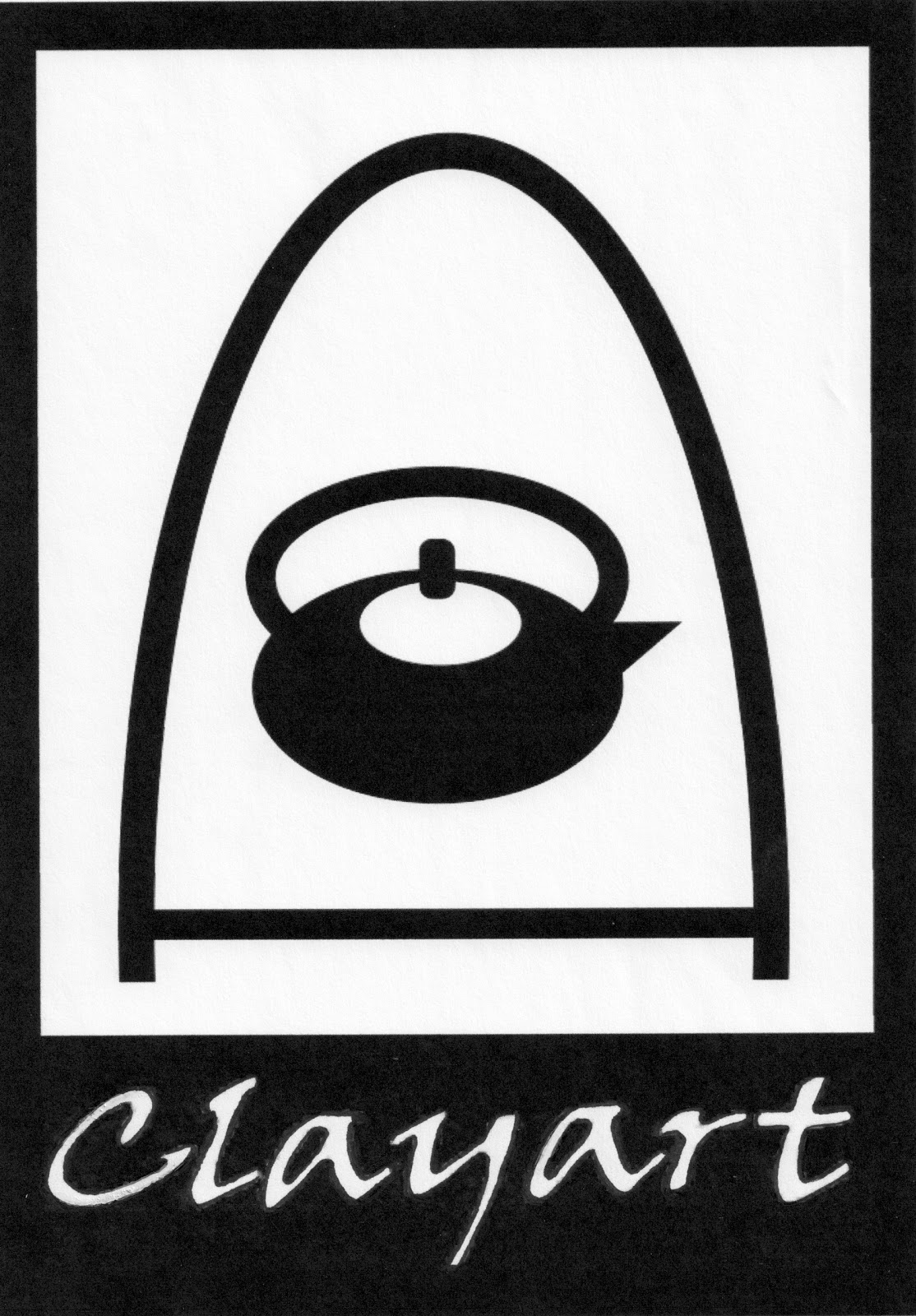
We are in our winter location and I've been working on designing the new logo for a Wiki page for CLAYART.
CLAYART is a worldwide clay artist's and a clay associated discussion email group that has been active for over 15 years. It began as an idea during a yearly National Conference for Education in the Ceramic Arts (NCECA) convention. I will explain NCECA and CLAYART further in future posts. But sufice it to say the internet email part of CLAYART is undergoing big changes at the moment.
One of the new changes was the creation of a wiki page. My part was to design a tiny, easily-recognizable logo to mark the upper left-hand corner of the site.
Being completely new to the designing of tiny wikis, I have been on an intense learning curve.
I don't have sophisticated computer design software, but I have had an undergraduate series of courses in computer design which I took just because they were available to me. And I discovered that through Apple Pages, I can do a limited amount of black and white work.
Warning: Some Graphics Geekdom follows--
The catenary arch design was made by stretching a black circle into an oval, then overlaying it with a white oval, adding a thick horizontal line to connect the bottom of the arch and suggest the floor of a kiln.
I blocked the bottom of the ovals with a lineless rectangle placed below the "bottom of the kiln" line and layered over the top (brought forward) of the oval shapes. That blocked the bottom sections of the ovals from view which is equal to erasing them.
The teapot was made by manipulating black and white ovals. And the handle to the pot is made the same way by layering a white oval over a black one.
The body of the pot is another black oval, with another white one imposed to suggest a lid. The lid knob is a standard shape available from the menu and layered over the black and white ovals (brought forward).
The whole design is on top of a black rectangle, which was sent to the back. This creates the top 3 borders of the logo.
The lettering at the bottom was lifted from a tiny graphic I had squirreled away and used on this blog some years ago.
This is fine for a tiny wiki, but when I wanted to enlarge it to a huge file for use in other ways, that's where the trouble began. All the enlargements resulted in shaggy, pixelated lettering.
I finally ran the whole thing out of my printer at page-size and, using a fine marking pen, smoothed up the letters one by one. Like, taking-off-your-glasses, sticking-you-nose-to-the-page making-pixels-go-from-squares-to-smooth-edges smoothing.
More later---
Written later than the above versions. Sorry for all the changes after the initial posting. On re-reading the first ones, I realized I could write a clearer description of the geek graphics.
Labels:
2-dimentional work,
design,
drawing,
Graphics,
internet,
Words and Art
Monday, November 5, 2012
Subscribe to:
Posts (Atom)